UI Elements Chart
Levels
Each line of the chart represents either support (if the current price action is above the level) or resistance (if the current price action is below the level).

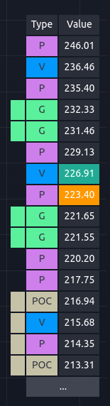
Level Table
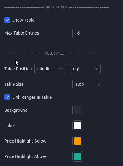
The level table is another view of the price levels and is helpful for quickly identifying where the current price is relative to the support and resistance levels. The closest level above the current price will be highlighted in green and the closest level below the current price will be highlighted in orange. Gaps and POC ranges are shown using the left most column to indicate that the values are connected and represent a range. The table can be moved around or disabled. The number of rows can be limited which is helpful if you are trying to save screen real estate.
| Table UI | Settings |
|---|---|
 |  |
Level Labels
Each line on the chart has an associated label which can be tweaked and disabled to fit your visual preferences. The labels contain not only the price but extra metadata.
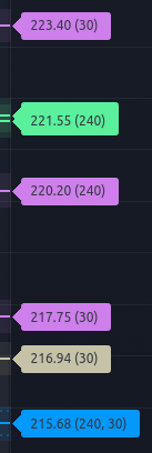
If 'Include Analysis Length' is enabled in the settings, each label will have a number inside parenthesis ex. ( 240 ). This number represents which analysis length was used to derive the level. Some stocks will tend to respect certain lengths more than others, so having this on the label can help inform how much confidence you put into each specific level.
After the analysis period there is a section for sub-type. This is primarily used for the Pre-Market and Previous Day levels to let you know what specifically each level represents.
PD L - Previous Day Low
PD H - Previous Day High
PD C - Previous Day Close
PM H - Pre-Market High
PM L - Pre-Market Low
PM O - Pre-Market Open
Hovering over the label will display a pop-up with additional information including:
- The Type
- The Analysis Period
- If the level was merged with another, it will include the type and original prices from those levels.
- Ranges will show the top and bottom of the range.
- Diff Current Price - How far the current price is from this level as a percentage.

A colon in the label shows that this level was merged with another of a different type. The values after the “:” will let you know the type that was merged. The “: P” at the end shows that this level merged with a Price level.
![]()
Level Bands - Ranges
In the settings there is an option to enable Boxes around each level. This will draw a box, in addition to a line, around each level to help remind you that the levels represent ranges and not exact values. Although you will often see prices react to the levels very precisely, each level is calculated with a certain amount of uncertainty. Showing them as a box is a helpful reminder to not trade to the exact price shown.
The box sizing is scaled for each ticker based on an average of the tickers ADR or Average Daily Range. This works well for most, but for some tickers you may find the boxes are too small or large. In this case using the “Box Size Multiplier” will allow you to fine tune the box sizing.
You can also adjust the opacity in this section of the config.
'Ranges' have been made more opaque for this example. The default style is much fainter.
